… is all that matters here!

Posts tagged ‘painting’

New video tutorial – how to make a wet felt picture

As you know if you’ve been following my blog, I love making felt paintings.  I have to say though, my life has been so busy with other projects for a few months, that I haven’t made any for ages.

felt-finished-with-background

Recently though, I was asked to make a video tutorial, so here it is. The pics don’t really capture the depths of the blues at the top of the painting, but I think you get the idea.

I had immense fun getting all my wool and silk rovings and searching through my yarn box for just the right variegated and also dimensional yarns, and then even more joy as the little painting came together.

I’m getting used to filming the process, and even the editing is taking less time – still a.g.e.s. – but I’m getting the hang of it, and the rendering and Handbraking and uploading to YouTube with the tags and what-have-you, so people who are searching for a felt picture tutorial, actually discover it!

My desire was to make an attractive picture that was easy to demonstrate, and also copy if someone wants to – without too many intricate materials or steps.  I may make a more complex picture later, if I get enough interest.  Or I’ll make another one for the love of it, and may even video it as I make it!

Here are some closeups of the details of the simple little Sea Beach picture:

So what next?

I do have a hankering to make another nuno scarf soon though because I want to do some eco-printing on it.  I have some rose leaves in the freezer from Valentine’s Day, waiting to be put to good use. Or should I say second use – the first being the expression of love. Ahh, soppy. 😉

If you’d like to watch the new video, here is a link.  Do let me know what you think, by writing in the comments. ❤


Mural – sneak preview 2

Well, painting straight lines and lettering on bessa block (breeze block for UK readers) makes the job a tad longer.  Also using prime colours (high quality outdoor house paint) means there’s a higher proportion of colour and makes the paint a bit see-through, so I have to do two coats.

So, the mural isn’t finished yet.

However, I’ve had some lovely feedback from teachers and parents – and lots of interest from curious students, which makes it all worthwhile!

Here’s today’s finished stage.


Stage 2 of mural at the school

Stage 2 of mural at the school


As you can see, I’ve finished the little Apps at the bottom and have completed the two top sections.  All I have to do now is fill in the bottom two sections and add some highlight/shading  remove the masking tape. Once the masking tape is removed, it should look fine.

I’m wondering though, to any readers who are painters – do you think it’s quicker, more efficient and more esthetic to use masking tape, or do you prefer to paint straight lines by hand?


Sneak preview of mural…

image

It’s at Beerwah Primary School and has been in the pipeline – well Queensland Education Department’s pipeline – for nearly 18months.

Today after the go ahead I began.

Any ideas what it might be?  (Think ideas to reinforce school policy to kids)…

Library Display

This is a quick post to show a couple of pics of a limited variety of my felting that is on display at Beerwah Library for two weeks.

If you aren’t in the area but would like to visit the library, the address is:

Beerwah Library, 25 Peachester Road, Beerwah Qld 4519. Phone for opening hours: 1300 542 727

It is lovely to have the opportunity to display my work locally.  I am a member of the Glasshouse Country Arts Trail and we have several weeks available to display members’ works.  Ilia Starkovsky is also displaying some of his photographic art, and Bronwyn Hill and/or Melanie Gray Augustin will also be bringing showing some of their work this fortnight.

A variety of my work in the display cabinet at Beerwah Library

A variety of my work in the display cabinet at Beerwah Library

Felt making and Arts Trail

This weekend has been very eventful!

Arts Trail – Open Studio

The Glasshouse Country Arts Trail has an open studio few days coinciding with school holidays – from Saturday just gone until Wednesday.

As last time I was fortunate enough to be able to share Sandra Price’s studio which is in her home on the main tourist route from Glasshouse Township to Beerwah.  It was a very pleasant weekend and we actually spent Saturday making conversation more than making art as it has been such a long time since we saw each other.  But it was very rewarding as conversation flowed with cups of tea and a tad too much chocolate…

I managed to complete my rose as a brooch by stitching the clasp onto the back, so it is now more than a pretty felt flower, but can be worn as well.

Sunday was more productive for both of us. Sandra worked on her elephant painting which was a development fascinating to watch as she brought beautiful Mma Tembo to life using a monchrome palette.  I am eager to see it finished.

While Sandy painted, I felted.  Because I was feeling quite tired this weekend, I couldn’t face a large project that would require lots of physical work, so I made two smaller pieces.

Miniature country scene

The first was a little country scene that I was going to use as an insert for one of those pre-made cards that has a frame cut into the front so you can put a painting behind.  I went a bit made with the wool layout though and the whole painting turned out too large for the card.  As luck would have it, Sandy happened to have the perfectly sized embroidery hoop which she suggested as a frame, so I attached the ‘painting’ to some cotton fabric and stretched it into the hoop.  Some of the corners sit just over the edge of the hoop but I rather like the effect.

Country scene 'round' felt painting 15cm

Country scene ’round’ felt painting 15cm

I’m actually pleasantly surprised at how this turned out.  Sandra really liked it too.  I will definitely make more of these.

Blue glass vase cover

The other smallish project I gave myself was covering the second of two tall slender glass vases I bought the other day.  If you read my recent post, you’ll have seen the first one which I covered in cream/orange.

This time I wanted to experiment with a completely different look.  I went for a covering in totally different colours, and laid in such a way that a lot of the glass would show through.

Colour palette of merino wool

Colour palette of merino wool

I chose dark blue, turquoise, lime green and cream as my palette.

I also used blobs of silk noile for details, and some ever gorgeous and lustrous silk tops.

Blue vase silk used

Silk noile and tops


The resist for this pattern was the same as for the last vase, as I knew it would give me a perfect fit.

I’ve never made anything 3D that is open weave before, so this was guess work, but I’ve got a couple of pics of the layout front and back, that I’ll show you.

As you can see, I’ve arranged the wool in such a way that it snakes up the vase.  I had no idea if this would work, or if it would end up all crumpled down the bottom of the vase like some old woman’s stocking, but I couldn’t resist giving it a go!

Here are the layouts, front and back:

Blue vase layout - front

Blue vase layout – front

Blue vase layout - back

Blue vase layout – back

As you can see, I made the base fairly solid, and also had a rim at the top, with the rest of the wool winding around the resist.  I varied the pattern using silk noile and silk tops.

As it wasn’t a large piece, it didn’t take a lot of work, but I was glad that it shrank to a size that it perfectly fits the vase.

Here is the finished result:


So while I made only two small pieces over the weekend, both were new territory for me, and it’s always good to stretch your creative boundaries!


New wall hanging – with bobbly bits!

I’ve been waiting for some wool nepps to arrive.

Wool nepps - 'bobbly bits'!

Wool nepps – ‘bobbly bits’!

Nepps are round, bobbly bits of wool that can be used in felting.  Gawd knows which part of the sheep they come from, but since I saw some on a website I’ve been itching to get my hands on some.

They arrived yesterday.

As I’d had a while to let my imagination run riot while I was waiting for Canadian and Australia Posts to talk to each other, I came upon a variation on a theme.  Another beach, only this time, instead of turning it into a realistic painting, I wanted to make it more impressionistic.

What was I going to do with my bobbly bits?

When I saw a photo of nepps, they reminded me of the smooth small pebbles I’d enjoyed sitting on when I was at Monaco another lifetime ago.

In the felt painting I envisaged, these little nepps would make great closeup grains of sand.

I’ve made this one a long, thin wall hanging 27 x 50 cm approximately.  It has lovely bright colours that flow from deep blue sky, to turquoise ocean, to yellow sandy beach, to white dunes with sand and some impressions of grass and rock/shell details.

Nepps layout

Nepps layout

The nepps were a little harder to felt than regular wool tops, but I persevered and most of them felted in.  I rather like the effect.

Ocean Sparkle

While I was ordering the nepps, I also ordered three little bags of different coloured Angelina Fibre.  This is great stuff and extremely reflective.  Less is more with this stuff unless you’re going for a disco look.

I added a few strands on top of the white silk tops that highlighted the waves rolling onto the beach. At different angles the light catches the fibre, and it looks like ocean spray sparkling in the sun.

Tiny threads of angelina fibre on top of the silk tops, to create 'ocean spray' effect.

Tiny threads of angelina fibre on top of the silk tops, to create ‘ocean spray’ effect.

The finished wall hanging

So, here it is, and I’m very happy with the result.  I like the longer thinner shape of this one.

Beach wall hanging, drying

Beach wall hanging, drying

I think the colours work well, and there’s enough detail to make it interesting without overdoing it… keeping it simple.

It is a style I will use again.

What next?

I have another piece of felt batt that I used as my ‘canvas’, so I want to make another wall hanging in a similar impressionistic style.

Not sure yet whether to do another beach scene, so I have a diptych, or a different theme altogether.

Open Studio Weekend 2

Despite it being a wet wintry weekend, Sandra and I enjoyed another shared studio experience.  While I think the weather put a lot of people from coming out so we only had a handful of visitors over the two days, we were very creative.

Sandra’s painting

On Saturday Sandra worked on a calla lily:

Sandra’s Calla Lily

Yesterday, she painted two in a series of three intuitive paintings, plus several beautiful bright birds and trees on small canvases.  I love how Sandy can change style according to what she’s painting, so she has a variety of work that can be appreciated by many. Sandy drying her artHere’s Sandra drying one of her intuitive paintings.  Let’s face it, with the cool and damp weather, rather than sit around watching paint dry, you’ve gotta love technology and a handy hair dryer. Don’t you love the colours she’s using?

You can read more about Sandy’s painting at her blog: Hearts Landscapes.

Aannsha’s Felting

On Saturday I made a small ‘earthenware’ coloured round bowl about 13cm in diameter.  I used a muted pale blue with maroon wool and a splash of orange wool, then accentuated it with maroon sari silk threads and mulberry hand-dyed silk rovings. I then created a cobweb scarf using pale blue and pinks, a nice combination that I haven’t tried before. I was happy with how I laid out the wool rovings as the resulting scarf had a good structure that was semi-translucent and having small holes across the work which is a mark of cobweb felt.

Felt 'earthenware' vase and pinkblue scarf

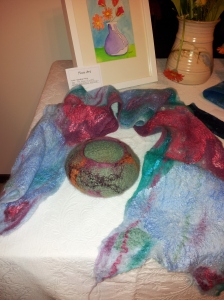
My felt bowl and scarf in front of Sandra’s painting

The experimental vase that looks like an upturned hat!

On the Sunday I gave myself a large project, wanting to experiment with a vase/vessel using a flat resist. The two round bowls I’ve made so far have been made using a circular resist.

Vessel making is a new avenue for me in felting, so when I decided to make a taller vessel, more like a vase, I wasn’t sure how to start.  I went for a flat resist and threw myself into the project giving myself permission to like any outcome however outlandish, as this was an Experiment.  It was actually a very big project and in order for the ‘vase’ to be sturdy enough to support its own weight, I had to work it very hard.  So this baby took all day to create!

I started with bright green, followed by a muted, earthy blue and did four layers alternating these colours one for each layer.  When I got to the decorative layer I went mad with orange, lime green, maroon sari silk, brown alpaca and red/grey silk hankies. When I finished laying out the top layer, it looked like something the dog had thrown up on to be honest.  But I was out on a limb and determined to see it through.

Decorative top layer of vessel - aka dog's dinner

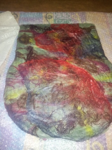
Decorative top layer of vessel – aka dog’s dinner

At first, it wanted to become a handbag and I struggled to go beyond a hesitant decision to stop at that point, knowing that a bag would be a good outcome.  But no.  I wanted a vase or a vessel of some kind and that was what I was determined to make. I worked on it some more until I had gone beyond the handbag stiffness, and knew at that point I was on the other side.  Where the vessel resided.

We stopped for lunch and had a salad.

Once more into the fray dear friend.

Occasionally I surfaced over the green brown thing it was becoming, to look enviously at Sandra who was producing beautiful work after beautiful work – she really is industrious!  I noticed that she too though was questioning her own colour choices and was surprised at how her own intuitive paintings were developing.

Eventually, when it was way past cup of tea time, we both stopped.  Sandra was all out of paintings, and I had finally mastered the beast!

The final result was totally different to what I’d pictured when I started, and certainly a world away from a handbag, but quirky though it is, I love it.  It’s a vessel that could be an upturned hat, as my son proved when I brought it home, but I reckon it works.

In my attempt to flatten the bottom and create an even oval base, I used a plastic bowl that was shorter than the vessel.  By the time I’d pushed the base into shape, I noticed I’d inadvertently pushed down the sides, creating deep wrinkles.  Wow, that was a great accidental serendipity!  I turned the top over by about four centimetres to  contrast the lovely lime inside with the now muted and gorgeous autumn shades of the outside.

Stepping back, I noticed the brown alpaca fleece fuzzing out in places, that adds interest. It stands about 20cm  tall and 18cm wide. Here are some pictures showing the process and finished vessel.

What would you use it for?

Did Sandy and I morph artistic styles? (Cue Twilight Zone music)

One thing Sandra and I noticed was that we’d both apparently switched colouring styles.  Most of my paintings and felt carry bold, warm colours, while usually Sandra’s work tends towards blues and pastel tones – well some, not all of her work.  This weekend though, I was favouring earthy colouring and using muddy browns and blues for the top layers of my work, while Sandra found herself painting in bright vibrant hues.

We’re both intuitive by nature and as we worked, both occasionally uttering, “Wow, this is an odd choice of colour for my work”, we also both came to a vague conclusion that we were possibly somehow ‘tapping into’ each others’ brains and morphing our artistic palettes!  There’s no proof of that of course, but it’s not out of the realm of possibility. So, that was our weekend.  I am looking forward to next weekend when Open Studio weekend 3 gets underway.  What will we create next?

Gallery

My first wet-felted wall hanging

Here is the felted painting. I will embroider in details when its dry. However, I'm pleased with how it has turned out. I like how the pineapple fields details show through. :)

Here is the felted painting. I will embroider in details when its dry. However, I’m pleased with how it has turned out. I like how the pineapple fields details show through. 🙂

I usually paint in acrylics, but since I’ve been felting for a few years, I’ve exercised my creative juices through wool and silk.

A few months ago I experimented with a felt ‘painting’ of Uluru.  It wasn’t bad, but was rough and ready in a few ways.  However it showed me that I had the potential to turn wool rovings into a recognizable picture.

Today was the day.  I got out my wool rovings, silk tops, silk noile, silk hankies and odd scraps of patterned chiffon and lace and a piece of cream pre-felt.

Then I took a deep breath.

This had been several weeks ‘cooking’ on the inside after I had the desire to make a felt wall hanging, but like any good baby it does take a while to bring it all together on the inside before it makes its appearance in the outer world.

I can’t say exactly what goes on in my psyche when I’m cooking a painting, but I think a lot of it is accepting the idea, pulling together thoughts about what I can make and how I can best bring it into reality.  Then there are the resistances that my desires and thoughts butt up against.  The ones that caution me not to waste resources in case it turns out like a dog’s dinner, or what will happen if I put all that time into creating something beautiful but which turns out like Rosemary’s Baby.

I’m all for fun and like to avoid frustration like most of us, so over the years I’ve learned not to physically start the project until I feel ready.  Otherwise the whole thing becomes an exercise in pulling teeth: very painful and very laborious.

Well enough rambling, I’ve got a few pics to document the process for anyone that’s interested.

You know, it never ceases to amaze me that you can basically start with raw unspun wool, mash it together with soapy water for ages and you end up with a stunning fabric.

Enough said.  Here’s today’s work:

I’m a late developer

…And sometimes I wonder if I’ll ever get it! Or get life. Or get me. Coonowrin Badyacc

For decades I’ve really done my best to fit in – gawd – conform – but it’s always got me into trouble. Not in the criminal sense. But in the personal soul-searchingly bleak lost and not quite found type trouble.

I’m writing this from the Sunshine Coast Hinterland of Queensland, Australia. I was brought up in the UK in the sixties and seventies and conforming was quite a big thing if you weren’t one of the flower power beautiful people. Especially if your parents were forty plus years old when they had you and wanted you to get on in life.

Trouble is, I’m an arty person. Creative down to the core, so even when I was parroting my times tables by rote in a chilly chilblain making classroom in the century old convent grammar school I attended – physically at least – the rest of me – heart, mind and soul was out of bounds, flying away with the fairies as my eyes followed the drifting clouds.

Career? Well, that’s a long and winding story too and right now, I’m just introducing myself and my new blog.

This blog is for the creative, intuitive self within that muses and amuses, crafts and creates.

If you’ve got this far, thanks for reading. I can’t guarantee I’ll stick to any one subject, but I’ll probably be sharing my thoughts, inspirations and frustrations with my art projects along with trips down memory lane and sorting of life’s events and self-understandings, as I continually search for creative expression of my true self, beneath and beyond conforming type conditioning.

This blog will follow my journey to clarity of self expression both as a person and also as an artist.  I paint mainly in acrylics (regular paintings and murals) and more recently (the last few years) have been working with wet-felting.  Wet-felting uses raw, unspun fine Merino wool which you mash for a long time with soapy water to create a textile.  I often mix it up with silk and lay it onto silk chiffon, or tissue silk to create soft, light, drapable nuno felt that is fabulous.

Here’s a picture of some of my felt:

These colours remind me of the beach!

These colours remind me of the beach!

The painting at the top is a picture of one of my paintings: It’s one of the Glasshouse Mountains – Coonowrin.

Salty tales from Bali Hai on Sunday

After a break from cruising of nearly 30 years, we are sailing to the Indonesian Islands on our yacht Bali Hai

SV Acheron

A Mediterranean Odyssey

ocean-pilgrim: Life on Water

Life in the Med, on Intention

esothemes

Reflections, revelations and proposals esoteric: Themes to elucidate the depths of human potential.

BeautyBeyondBones

Because we’re all recovering from something.

Open the Door to Your Inner World

Access: Transformational Energy, Guidance, Creativity, Life Purpose

The Procrastinator Dyer's Diary

A Journal of Observations

Beesybee fiber's Blog

Life in West Marin seen through the eye of a needle

Principally felt

experiments in life, decorative felt, nuno, knit felt and mosaic

Obovate Designs™

My dabbling and exploration in contact printing, natural dyeing, and soap making

nancybrownstudio

murals, textiles, ceramics, screenprints, festivals, community

THREADBORNE

Fibre Art, Eco Printing, Natural Dyeing, Book Arts

vintage country style

my move to countryside and planning a crafts business

MarmaladeRose

... is all that matters here!

Hearts Landscapes

... is all that matters here!

Colour Cottage

little house in a field

dedepuppets

dada inspired hand puppets

The Blog of Knitted Fog

art, life and stuff